
For the last twenty years, human-computer interfaces have been dominated by two-dimensional interaction techniques. Things are changing. Techniques that were previously restricted to specialised CAD/CAM tools and immersive VR systems are now being extended to the mass market. The photo-realistic facilities offered by QuicktimeVR and the model based renderings of VRML (Virtual Reality Mark-up Language) provide sophisticated tools for interface design. As a result, three dimensional visualisation techniques are being widely exploited in the financial services industry, airports and even off-shore oil production. Unfortunately, research in human- computer interaction lags well behind commercial practice. There are few guidelines that can be applied to support the development of these 3D interfaces. In consequence, users often report intense frustration as they navigate around virtual information spaces. This paper, therefore, describes a number of evaluations that have been conducted to examine the usability problems that affect these interfaces. It is concluded that the standard measures of task performance and subjective satisfaction cannot easily be applied to assess the utility of 3D systems. Finally, Gibson's work on direct perception is used to explain why people find it difficult to identify the underlying usability problems that affect this new generation of human-computer interfaces.
Keywords: direct perception, three dimensional imaging, VRML, QuicktimeVR.
In contrast, this paper explicitly focuses upon the new generations of desk-top, photo-realistic 3D presentation techniques. Over the last two years we have built a large number of VRML and QuicktimeVR applications ranging from Museum information systems to training tools for regional Fire Brigades. We have also conducted a wide range of evaluations to assess the utility and usability of these applications. Our results have shown that conventional usability measurements in terms of task performance and subjective satisfaction provide little insight into the qualitative differences that users observe between convention 2D presentations and the emerging 3D technology. Later sections of this paper using Gibson's work on the direct perception of pictures to explain these findings.
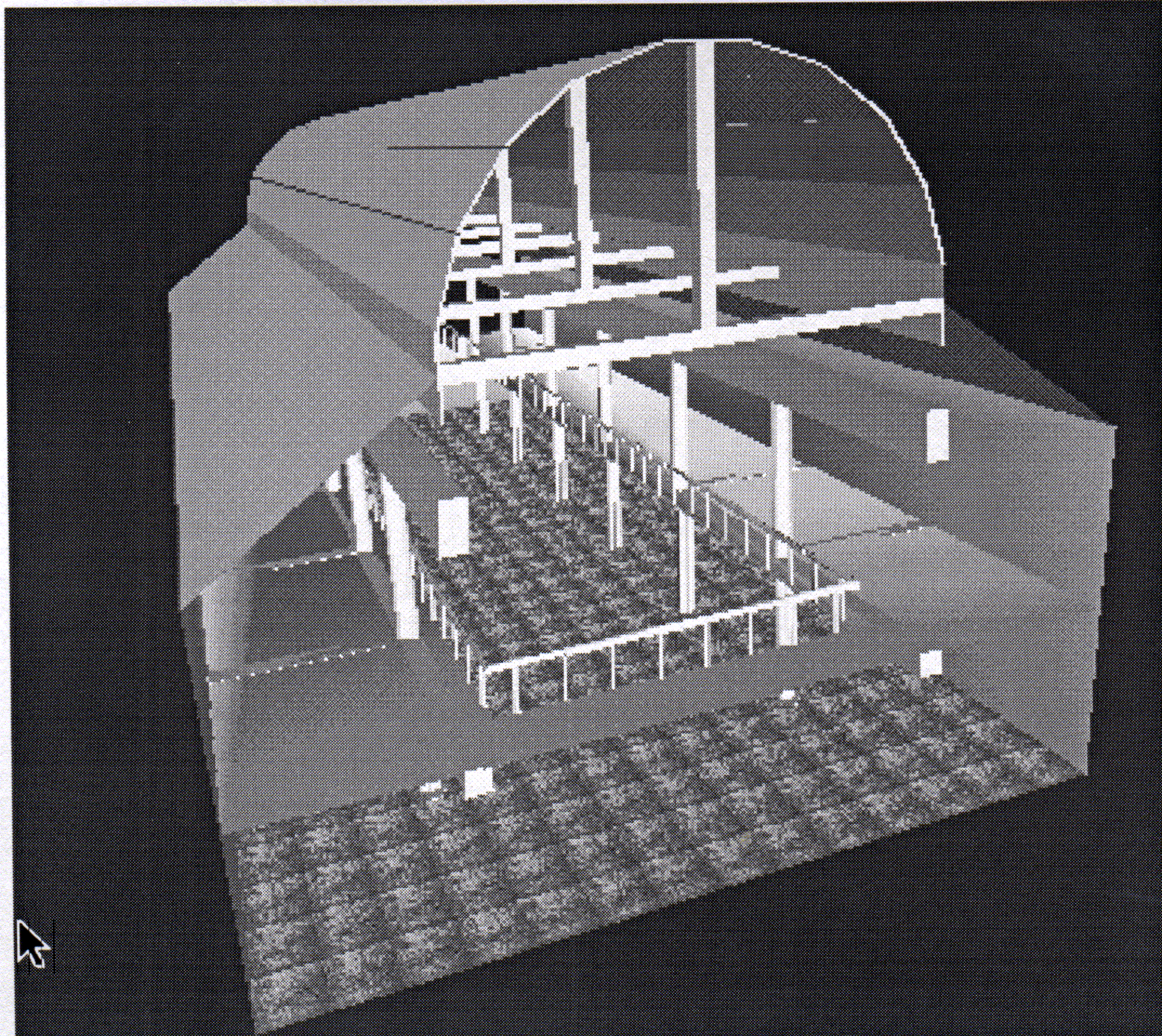
The Virtual Reality Mark-up Language (VRML) is a platform independent language for composing 3D models from cones, spheres and cubes. These primitives are combined to create more complex scenes such as those shown in Figure 1. One of the reasons for the rapid rise in the popularity of this medium is that it provides interface designers with a means of delivering 3D interfaces over the web (Johnson, 1997, 1997b). With the advent of VRML 2.0 it is possible to generate and animate scenes that contain links to a wide variety of other information sources including videos, databases and other web pages.


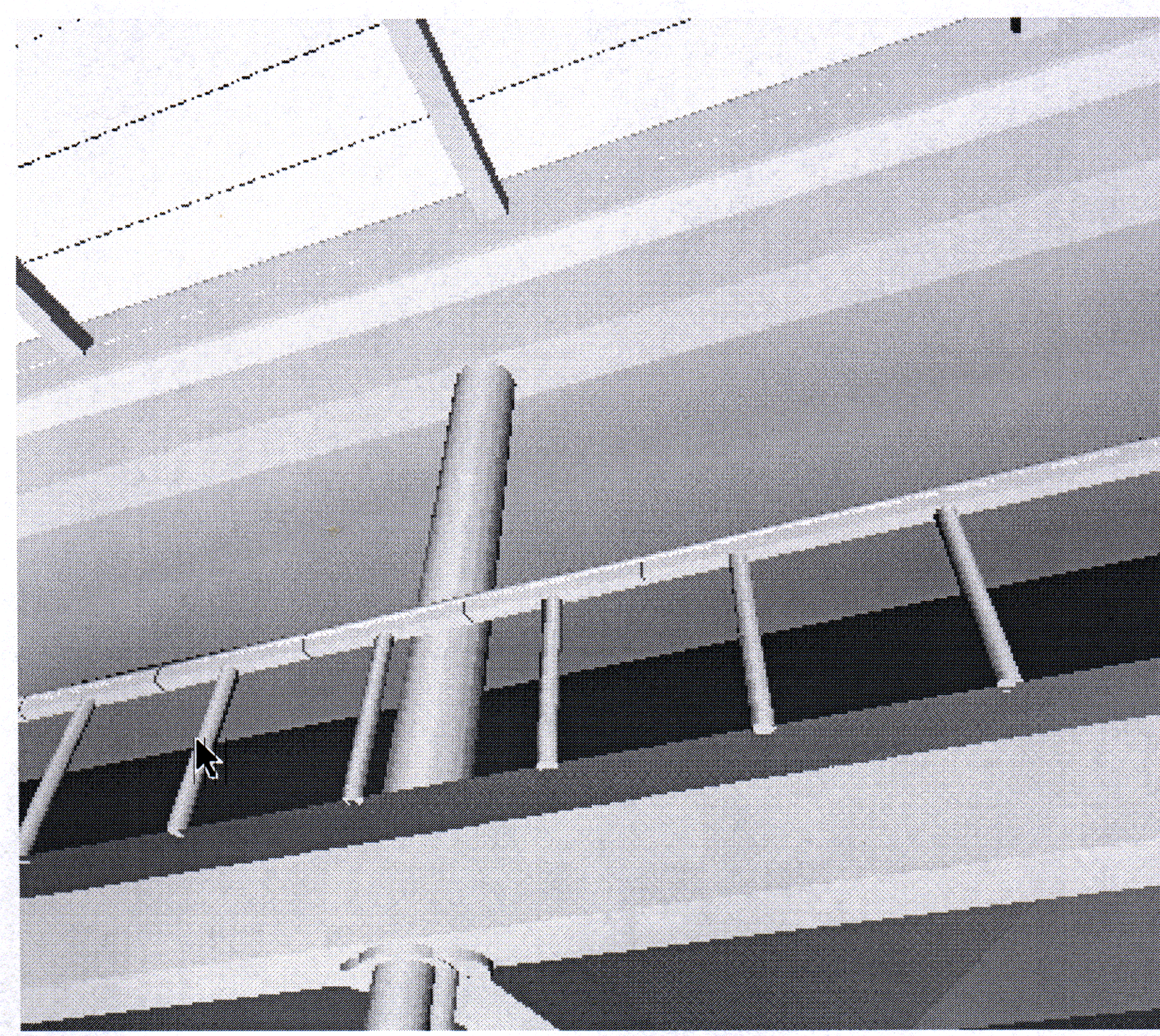
In contrast to VRML, QuicktimeVR offers interface designers with the means of rapidly generating three dimensional resources without the costs of model building. Rather than painstakingly transforming and translating primitive objects, this approach works by shooting a large number of photographs. A viewer is then used to 'stitch' the images together so that users can pan around or zoom into a 3D scene. The photographs are taken using a motorised tripod and a digital camera so that large buildings and complex objects can be recorded in a relatively short period of time. This offers strong commercial advantages over the VRML approach which requires considerable time and skill in order to construct relatively simple worlds. Figure 2 shows an excerpt from a QuicktimeVR tour of the Macintosh House in Glasgow. As with VRML, the visualisation facilities supported by QuicktimeVR have recently been extended to support more complex forms of interaction through the introduction of embedded links to other resources.

Having introduced the underlying technology that supports desktop VR, the remainder of this paper goes on to examine the usability problems that characterise interaction with these applications. In particular, it is argued that 'conventional' evaluation techniques fail to capture some of the critical features that characterise interaction with this new generation of user interfaces.
"The furniture was a skilful mix of dark-stained items, mainly of the late 1890s, and white- painted pieces of the early 1900s. Certain items are those exhibited in Mackintosh's lifetime to great critical acclaim on the Continent. For example the stencilled chairs and oval table by the long south window in the drawing room formed part of the Mackintoshes' celebrated room setting 'The Rose Boudoir' exhibited in Turin in 1902." (See http://www.gla.ac.uk/Museum/MacHouse)
This excerpt illustrates the benefits of text. Natural language provides a flexible, ambiguous and rich medium within which to convey information to the user. For example, the use of the phrase 'certain items' enables the writer to refer to a set of objects without explicitly identifying those objects. Such ambiguity would be difficult, if not impossible, to represent within a 3D visualisation. From this it follows that some media are better suited to particular communications tasks than others. A further criteria for desktop VR is, therefore, that: there must be a clear fit between the medium being used and the information being conveyed.
This section has identified three criteria against which designers might assess the utility of three dimensional human computer interfaces: there must be a clear contribution from the 3D model or visualisation to the user's task or information need; the interface's browsing facilities must enable users to quickly traverse and manipulate the scenes and objects that the new technology provides; users should exhibit strong subjective satisfaction ratings in support of the application of desktop VR systems. It is important to emphasise that this is not an exhaustive list. Many other criteria can also be applied. It is clear, however, that we must establish some starting point for research into the usability of these interfaces. The following section, therefore, describe initial attempts to apply these criteria during the evaluation of three dimensional interfaces.
Further problems prevent designers from assessing the task contribution of desktop VR. It can be difficult, if not impossible, to evaluate the benefits that VRML and QuicktimeVR provide even for a single group of users. For instance, the schoolchildren who accessed our site were set some predetermined questions by their teacher. A contribution to this task could be measured in terms of the mean class score. However, this would not capture any long term learning effects that are a principle motivation for the application of Information Technology in the class room. Similarly, such a 'shallow' evaluation would fail to capture any motivational effects. We have already argued that 'fun' is an important, and even necessary, justification for the application of desktop VR.
Task and user diversity, as well as the importance of motivational factors, make it important that designers take a very broad perspective upon the contribution made by desktop VR systems. This diversity also makes it critical that designers challenge previous assumptions about the support which particular media provide for particular tasks. For example, the VRML gallery was evaluated against a series of text-only web pages. These provided links to digitised video clips and QuicktimeVR movies. It was hypothesised that the text based interface would support users with directed information retrieval tasks. Users did not have to navigate around a three dimensional VRML model. Figure 5 presents the results of an evaluation involving two classes of primary level schoolchildren. Their attitudes to retrieval delays were assessed ; this measure was chosen because preliminary studies indicated that this was a critical factor in the successful adoption of the web based systems in local schools. As can be seen, the children had broadly the same reaction to the interface whether or not they were 'directed' by comprehension questions set by their teacher (Johnson, 1997a).
(a) Browsing User
(b) Task User
The findings of our studies with schools came as a considerable surprise. We were unable to establish the hypothesis that task directed users would prefer a text based interface to the overheads of navigating through a VRML model (Johnson, 1997a). However, the more general point here is that current measures of 'task fit' cannot easily be applied to assess the suitability of a particular media for a particular task, far less to make comparisons between different media over a range of tasks. This has serious implications for design. Unless HCI research begins to provide more guidance about the suitability of particular media then designers will be forced to rely upon ad hoc decisions and simple guess work. Unless HCI research begins to provide more guidance about the suitability of particular media then users will be faced with gratuitous QuicktimeVR and VRML that lacks any consideration for their everyday tasks and information needs.
Given the problems mentioned above, it seems more productive to explore a more qualitative approach. Designers can compare different user attitudes to the navigation facilities provided by a number of desktop VR systems. For example, Figure 6 illustrates the interface to an early predecessor of the VRML gallery shown in Figure 1. This interface relies upon image maps to download a number of still images as the user navigates through photographs of the Hunterian's main exhibition area. The image on the left of the screen provides an overview of the user's position in from of the exhibit case that is shown in the right hand image. Users navigate by selecting the arrow icons at the bottom of the page. Clearly, as designers, we wanted to establish whether the navigational facilities provided by VRML were a significant improvement upon those offered by our previous implementation. In VRML, users navigate by selecting a mode of navigation, such as walking or flying, and then press the mouse to move 'into' the scene. The intention in this style of interaction is to avoid the additional indirection of navigating through explicit arrow keys. Although, as can be seen in Figure 3, some VRML viewers also offer this navigation facility in addition to mouse based interaction.
Figure 7 presents the results from a comparison between the navigational facilities provided by the interface in Figure 6 and the VRML gallery shown in Figure 1. In contrast to the previous evaluations that focused upon school children, these tests involved a broad cross section of users from the different categories mentioned in the previous section. This was important because we hypothesised that skilled computer users would be better prepared to face the challenges that are posed by 'conventional' input devices when navigating in three dimensions. Initial results have confirmed this hypothesis but, like so many of issues in desktop VR, we urgently need further work over a broader spectrum of users and a wider range of interfaces.
Perhaps the most striking feature of Figure 7 is the similarity between the two sets of results. Users reported few difficulties in navigating both the VRML model and the image-mapped interface. Again, this came as a considerable surprise. Many aspects of the VRML browsers are counter-intuitive. Our users had little or no experience of navigating through complex three dimensional spaces using keyboards and mice. They only received a minimal training session before interacting with the Gallery. Perhaps more surprising still is that 'think aloud' evaluations revealed that many of our users felt considerable frustration about the navigation facilities that both systems offered even though they stated that it was 'straightforward' to move around the Museum. As with task fit, our findings suggest that our previous experience with two dimensional interfaces leaves us spectacularly ill-equipped to understand what is going on during interaction with three dimensional systems. Our intuitions often prove false and users often contradict our initial understanding of complex interactions.
A series of web pages were developed to provide users with access to models such as that shown in Figure 8. The results shown in Figure 9 were obtained by showing the resulting pages to people in the Museum itself. At first, we were worried that the Hawthorne effect might have biased our results. Visitors might have been too enthusiastic because we were clearly demonstrating 'new technology'. However, it is interesting to note that even under these conditions there were users who were prepared to state that the QuicktimeVR exhibits added nothing to the web pages, The graph on the right presents the reasons given by those who said that the QuicktimeVR exhibitions did add something to the Museum's web pages. Yet again, these initial findings are challenging our assumptions. The motivational impetus of keeping attention for longer is less important that providing a greater 'feel for the object'. Of course, these findings are not statistically significant. Nor could they be when we deliberately chose to monitor 'real' users interacting on the Museum floor. They are, however, indicative of the pressing need to perform more research in this area. Our experience of building desktop VR systems is unlike any other in the field of HCI, previous biases and assumptions about user performance and behaviour are being continually challenged.
Evaluator:	Do you prefer pictures or the models?

User: 	The models are great.

Evaluator: 	Why?

User: 	Um, it just feels different.
There is a noticeable difficulty in actually explaining what does or does not contribute to a successful three dimensional interface. This has profound implications for designers. If users cannot explain exactly what they do or don't like about desktop VR then it will be extremely difficult to exploit iterative design techniques. User feedback is effectively blocked by the problems that people face when trying to verbalise their experiences in virtual worlds. This observation should not be surprising. For example, a number of authors have argued that there are visual properties that cannot adequately be verbalised:
"(My) theory accounts for the differences between verbal and visual thinking. Visual thinking is freer and less stereotyped than verbal thinking; there is no vocabulary of picturing as there is of saying. As every artist knows, there are thoughts that can be visualised without being verbalised''. (Gibson , 1971).
This citation is interesting because it helps to establish a link between our observations during the development of 3D interfaces and Gibson's theories of direct perception. These links can be extended. For example, Gibson argued that textual representations provide a very indirect means of describing the real world. Pictures provided more direct representations. It can be argued by extension that desktop VR systems increase the directness even further. We have argued from Neal's work that analogy is a vital element in the success of QuicktimeVR and VRML. This in turn provides a further explanation of why users find it so difficult to describe their interaction with many of our systems:
"Not only do we perceive in terms of visual information, we can also think in those terms. Making and looking at pictures helps us to fix these terms. We can also think in terms of verbal information, as is obvious, and words enable us to fix, classify and consolidate our ideas. But the difference is that visual thinking is freer and less stereotyped than verbal thinking: there is no vocabulary of picturing as there is of saying.'' (Gibson, 1971).
It is important to emphasise that we are not attempting to use Gibson's work on direct perception as a framework for understanding every aspect of interaction in three dimensions. In particular, his theories have little to say about the consequences of interacting with a scene rather than simply observing it. However, it is certainly true that software engineers and interface developers urgently require more guidance about how to effectively design interfaces using desktop VR technology.
The lack of work in this area is surprising. There is a huge body of Psychological literature on the perception of movement, on pattern recognition in complex scenes, even on interaction with objects in three dimensional space (Gordon, 1990). The problem is that hardly any of these findings have been applied to desktop VR. This omission must be rectified if we are to improve the usability of QuicktimeVR and VRML interfaces. Research in the field of HCI has fallen well behind commercial practice. For instance, a recent Internet search revealed 51,000 VRML models on the web. It is regrettable that few of them had any HCI input.
We have tried to address the problems mentioned above by developing criteria that might be used to assess the utility of 3D interfaces: there must be a clear contribution from the 3D model or visualisation to the user's task; the interface's browsing facilities must enable users to quickly traverse and manipulate the scenes and objects that the new technology provides; users should exhibit strong subjective satisfaction ratings in support of the application of desktop VR systems. Unfortunately, our attempts to apply these criteria during the development of VRML and QuicktimeVR resources has been less than successful. We have found great difficulties in clearly defining the intended user population for many of these applications. Indeed, our clients often cite the accessibility of desktop VR as a key motivation for their use of the technology. It must support many different people doing many different tasks. We also found great difficulty in obtaining clear results about the navigation problems that users experience when using 'conventional' keyboards and mice to navigate three dimensional space. Users reported few problems in traversing VRML models. This came as a great surprise; observational studies have shown that people often have considerable difficulty in orienting themselves using existing environments. Finally, our attempts to assess the users' subjective experience with desktop VR raised a number of fundamental questions about the perceptual and cognitive processes that characterise interaction in three dimensions. People find it extremely difficult to describe the features that contribute to successful and unsuccessful interfaces to desktop VR applications. Fortunately, there is a considerable body of results from the Psychological literature that might be applied here (Gordon, 1990). Unfortunately, none of it considers the particular characteristics of 3D interaction with desktop VR. Until this omission is rectified, HCI will continue to lag behind the commercial application of this technology.
As a closing remark, the think aloud sessions, mentioned above, not only illustrates the general problems that people face when trying to explain the difficulties they feel when interacting with desktop VR. They also illustrate the deep sense of frustration that can arise when things go wrong in these systems. This frustration helps to mitigate the sense of enjoyment that is a strong motivation for the introduction of 3D interfaces:
Evaluator: 	How are you trying to find the exhibit?

User: 		I'm looking for the exhibit from the picture and trying to move
		towards the area that seems most relevant...this area bears no relation
		to where I wanted to go....
It is a sad fact that the user could have been talking about almost any VRML or QuicktimeVR application.