For related work, see also On the Use of Pseudo-3D Images in Human Computer Interaction (full paper)
The Ten Golden Rules for Providing Video Over the Web
or
0% of 2.4M (at 270k/sec, 340 sec remaining)
The World Wide Web offers huge scope for the distribution of multimedia resources. Text, graphics, video and
sound can easily be retrieved by users with only a minimal understanding of the underlying communications
mechanisms. Unfortunately, the quality of web-based resources often dampens this initial enthusiasm. The
production values and editing standards of video and audio material can be extremely poor. This is hardly
surprising because designers have little or no advice about the delivery of such material over the web. Previous
guidelines for word processors, databases and even computer supported co-operative work systems cannot easily
inform the design of web based applications. The unpredictable nature of retrieval delays and high download
latencies have created new types of usability problems. Existing experimental techniques cannot easily be used
to investigate the dynamic nature of interaction with distributed resources. This paper, therefore, presents a
number of guidelines that are intended to improve video retrieval over the web. These principles have emerged
during the development of a number of existing sites. Without such guidelines, users will be condemned to tie up
their machines for long periods while mediocre footage is retrieved across heavily loaded networks.
Introduction
The very success of the world wide web has led to two different sorts of problems. Firstly, the rising numbers of
users has created a demand crisis. Many servers simply cannot satisfy the number of requests that are being
made for their information (Dix, 1987). Secondly, the increasingly rich, multimedia resources that are available
over the world's computer networks have created a supply crisis. The introduction of sound and video material
has massively increased the amount of information that must be transferred between remote sites. In
consequence, retrieval delays have reached a stage where many sites suffer from a form of 'electronic gridlock'
(Johnson, 1995).
It is important to emphasise that many of the standard results from human computer interaction cannot be applied
to web-based systems (Gray, England and McGowan, 1994). For example, previous studies have concentrated
upon the effects of predictable delays or delays that have some fixed upper bound (Kuhmann 1989, Johnson,
1993, Teal and Rudnicky, 1992). These conditions do not exist during interaction with the web. In the absense
of any substantial body of literature that can be applied to support web-based video material, this paper presents a
number of principles or heuristics. These guidelines are backed both by experience in the development of web
pages and by the results of limited empirical investigations. They are, however, partial. They do not cover all
of the design decisions that must be made during the development of a video site. For instance, the principles do
not address the technical direction of video material (see May and Barnard, 1995). They are, however, intended
to support the development of web-based video pages in the absense of more detailed empirical evidence in this
area.
A number of common concerns motivate the principles in this paper. Firstly, designers must consider the
physical limitations of the underlying infrastructure that supports the presentation and distribution of video
material over the web. It is little use providing material for a world-wide audience if most users have to tie up
there machines for anything up to two hours while a large video file is downloaded from a remote site.
Secondly, designers must consider the characteristics of their users' tasks. These have a profound impact upon
individual attitudes to both retrieval delays and the production quality of video material. Finally, designers must
consider the visual layout and appearance of pages that present video resources. Designers must provide some
indication of the production quality of a film if users are to identify valuable footage from the mass of poor
quality material that is currently available on the web.
Principle 1: Avoid Video for Video's Sake
The first question to be faced by any designer that is interested in providing video resources over the web is: why
bother with video in the first place? Too often, video clips simply contain 'talking heads'. There is little or no
value added by moving away from a purely textual or graphical medium. In contrast, Figure 1 illustrates the
effective use of video by the Hunterian Museum's web site (see http://www.gla.ac.uk/Museum). These stills
provide some idea of the protective value of a Roman shield. Unfortunately, they do not provide an accurate
impression of the 'three dimensional' protection afforded by the armourr which is provided by the original video
clip. Such information is difficult, if not impossible, to convey using text or even a static exhibit on the Museum
floor.



Figure 1 : Excerpts from the Hunterian's Video on Roman Armour.
Principle 2: Make Sure That Users Can Access the Video
Having decided that video is necessary to a web page, designers must determine if users can actually access the
material? It is of little benefit digitising large quantities of footage if users do not have access to appropriate
viewers. Figure 2 illustrates the way in which the Fast Player video software can be called as a helper
application within the Netscape browser. Providsing users with information about how to set up video viewers
might seem like a trivial issue but, again, it is important to realise that this can have a considerable impact upon
the effectiveness of video material (Johnson and Kavanagh, 1996). At the very least, web sites that provide
access to video resources must also provide links to appropriate viewers.
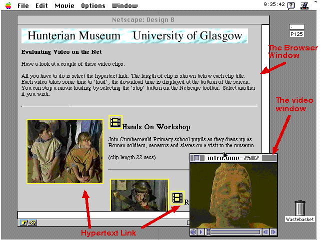
Figure 2: Using a Browser and a Helper Application to Access Video on the World Wide Web
A number of other factors ought to be taken into account if designers are to ensure that users can access video
material over the web. In particular, the network infrastructure has a profound impact upon an individual's
ability to download large files from remote servers. Figure 3 shows the amount of time that is required to retrieve
the same video file under optimal loading using a number of different network technologies. The total running
time for the clip was approximately eleven seconds. These findings suggest that designers must consider
alternative media if the users of a video resource routinely require modem access. Under heavier loadings the
delays become exponentially greater. As a result the costs, both in terms of telecommunications charges and
machine time, may be prohibitive.
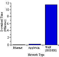
Figure 3: Retrieval Delays Over Different Network Connections
Principle 3: Maximise the Production Quality
Users will only exploit video resources if the benefits of accessing the material outweigh the cost in terms of the
retrieval delay. It is, therefore, important for web designers to maximise these benefits by ensuring high quality
production. Techniques for directing and shooting video footage are addressed in a range of professional
publications (Bernstein, 1988). However, production quality is not only determined by the way in which a film
is shot. It is also affected by the techniques that are used during the digitisation process. For example, frame
sizes can be altered so that only a particular number of pixels are stored for each image. The lower the frame
size, the lower the quality of reproduction. The number of frames per second also affects the quality of a film.
The lower the number of frames, the lower the quality of movement. There are, however, no 'optimal' settings for
these parameters. Films with rapid motion naturally require higher frame rates. Films that present close-ups of
complex objects require higher frame sizes. The critical point here is that unless designers consider these issues
then the resulting videos will be useless. It is no-use down-loading a video of a horse running if the frame rate is
so low that the user is presented with a jerky parody of the animal's motion. Similarly, it is of little benefit
retrieving a video of a sculpture if the frame size is so low that the user cannot recognise the object. Gain and
sample rates for sound reproduction play a similar role to that of frame size and rate for moving images. Unless
designers consider these issues then the quality of the video will have a direct impact upon the 'usability' of the
final resource.
Principle 4: Edit The Clip to Maximise Content and Minimise File Size
After a video has been produces, designers must edit the raw footage into a number of clips that can easily be
retrieved over the web. Unfortunately, this editing process cannot simply be based on artistic merit. Figure 4 (a)
shows that download time is proportional to file size. Figure 4 (b) shows that the length of a video determines
the file size. Together these graphs show that the longer the film then the bigger the file and that the bigger the
file then the longer it will take to download.
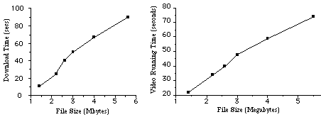
(a) Variable Download Latency with File Size
(b) Variable File Size with Length of Video
Figure 4: The Relationship between video file size, download latency and video running time.
The graphs presented in Figure 4 have a number of practical implications for the design of web pages. For
instance, the following table shows that in one evaluation only two out of ten casual browsers were actually
prepared to wait for ninety seconds while a video file was retrieved from an otherwise unloaded local server.
The other eight users all decided to abandon their request before the transfer was complete. None of the users
successfully retrieved the file with a download time of over three minutes (Johnson and Kavanagh, 1996):
Running Time (Approx. Seconds)	19	32	58	100	250
Download Time (Seconds)		11	25	50	90	241
Successful Requests (10 users)	10	10	10	2	0
The evidence of this limited evaluation does not imply that all videos should be cut into segments that can be
retrieved in under a minute. On the other hand, there are clear advantages to be gained from providing videos
with a range of different running times. This enables users to start with relatively small clips and then only
download longer films once they are satisfied with the content and production quality of the shorter videos. For
the designer, this suggests that greatest attention ought to be paid to shorter clips so that users are 'persuaded' to
access the longer material!
Principle 5: Use Mirror Sites if Necessary
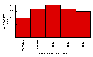
The times shown in Figure 4 were obtained over a local area network with only a light loading. The impact of
file size on retrieval delays is proportionately greater over remote networks. Figure 5 (a) illustrate the
importance of geographical location for retrieval delays. A number of users were asked to download the same
video file at approximately the same time of day (Johnson and Kavanagh, 1996). Te file was 770K in size and
had a running time 11 seconds . As can be seen from the graph, retrieval delays are heavily influenced by the
user's location. It is important to note that this does not mean that delays are not determined by the user's
geographical distance from a resource. It takes longer for a user in Dublin, which is 200 miles away from
Glasgow, than it does for a user in Montpellier , 900 miles away. This is due to a 256kbit line between Ireland
and the United Kingdom. If designers were providing a resource for use by Dubliners then the web page would
have to be designed as if Dublin were geographically further away than Montpellier. This implies that any
attempt by designers to define optimal file sizes and hence acceptable delays must be indexed by the relative
position of the user to the resource (Johnson, 1996). Figure 5b) adds complexity to this analysis because
retrieval delays vary throughout the day. Figure 5b) accurately mirrors the peaks and troughs of demand on
Glasgow University's computing infrastructure.
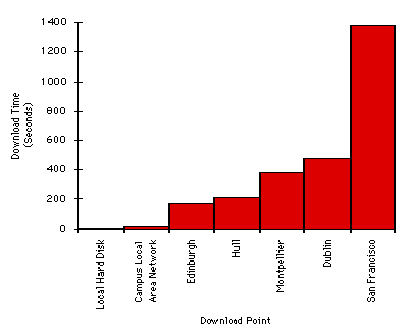
(a) Variable Download Latency with Location
(b) Variable Download Latency with Time
Figure 5: The Relationship between Download Latency, Geography and Time of Day.
Having recognised the impact that both time and place have upon retrieval delays for video resources, it is
important to ask what can be done to combat these problems? Firstly, designers must identify the boundaries of
acceptable and unacceptable delays for the users of their resources (Johnson, 1996). These boundaries must be
indexed by the geographical location and network resources of the target population. For example, the Hunterian
Museum's video archive is intended to support schoolchildren in the West of Scotland. Designers should not,
therefore, produce a web page that can only be accessed over the high speed networks that connect Glasgow to
Southern California. Secondly, if average delays extend beyond these limits then designers must take steps to
reduce the impact of physical, or rather network, distance. For instance, mirror sites can be provided. Video
segments can be shortened to reduce file sizes and hence retrieval times. Other delivery mechanisms, such as
CD-ROMs, might be considered. Alternatively, designers might argue for improvements to the supporting
infrastructure. For example, the delays between Glasgow and Dublin, shown in Figure 5 a), may be reduced as a
side-effect of a new 512kbit line across the Atlantic.
Principle 6: Cater for Differences Between Browsers and Directed Users
Browsers are less tolerant of retrieval delays than people with a clear 'task' (Pjetersen, 1989, Johnson, 1996).
Such findings have important consequences for the provision of video material over the web. Designers might
support task-directed users by providing longer clips and larger file sizes because these users are generally more
tolerant of retrieval delays. However, things are seldom this clear cut. For example, the Hunterian video pages
were designed to support school projects about the Romans in Scotland. Exercises were included so that teachers
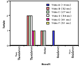
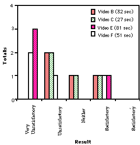
could direct the children's search within the video 'archive'. Figure 6 presents different attitudes towards retrieval
delays. It compares the responses of children who were answering these questions to those who were not
(Johnson, 1996). Each group contained the same number of children but two more videos were successfully
retrieved in the task directed group.
(a) Browsing User
(b) Task User
Figure 6: Attitudes to retrieval delays for task-directed users and casual browsers.
The results revealed generally negative attitudes to the download time. We could not, however, establish the
hypothesis that casual browsers exhibit different attitudes towards retrieval delays than task directed users
(Johnson and Kavanagh, 1996). A number of factors may explain the differences between these findings and
those cited above. For example, there may be differences in attitudes to retrieval delays between adults and
children. These differences may, in turn, be influenced by the extent of the delays involved by particular tasks.
Attitudes may also be affected by the unpredictable nature of delays over the web (Johnson, 1995). With so little
research into these problems, it is dangerous for designers to extrapolate beyond the experimental conditions of
previous investigations. In such circumstances, there are few short-cuts and no substitutes for first-hand
evaluations.
Principle 7: Use Page Layouts To Indicate The Quantity and Quality of Video Material
Principles 3 and 4 argued that designers must optimise the trade-off that exists between production quality and
file compression. Such techniques are of little benefit if users cannot recognise the quality of a resource from the
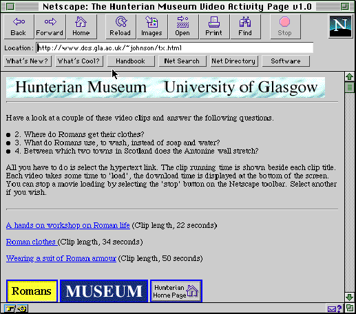
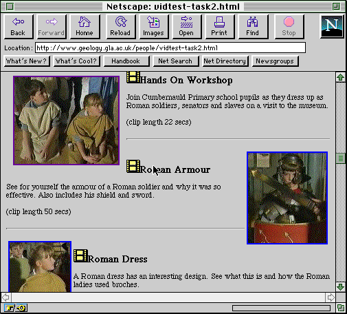
pages that are used to index them. For example, Figure 7 presents two different approaches to the presentation of
video material. In the first page, textual links provide few cues about the content and quality of the video clips.
In the second interface, thumb-nail sketches present still images from the videos. This provides a number of
advantages. Users can view a small portion of the material without incurring the penalties of a full retrieval.
The provision of thumb-nail sketches helps users to plan their subsequent retrieval strategy while waiting for
another video to download. The still images also indicate the production quality, or more specifically the frame
size, that is used in the digitisation of a video. This would, of course, only work if the designer did not
specifically enhance the resolution of the thumb-nail sketch as a means of enticing the user to the video!
(a) Textual layout
(b) Cinematic layout
Figure 7: Page Layouts for Video Resources.
Page layouts not only affect the aesthetics of an interface. They can also affect attitudes to retrieval delays. For
example, the experiment in the previous section was repeated using the cinematic interface of Figure 7 (Johnson
and Kavanagh, 1996). As before, the intention was to identify any differences between casual browsers and
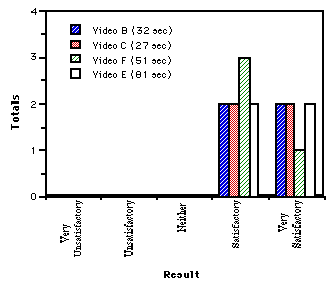
'task-motivated' users. The results of this analysis are presented in Figure 8. The children were more positive
about the retrieval delays with the cinematic layout, irrespective of whether they had a task to perform. As
before, however, there were no significant differences between task motivated users and casual browsers.

(a) Browsing User
(b) Task User
Figure 8: Attitudes to retrieval delays for the Cinematic page layout.
Principle 8: Assess the Impact of Retrieval Delays Upon Overall Task Satisfaction
Many of the principles in this chapter are intended to reduce the problems that arise when videos take many
minutes to download from remote sites. It is important to emphasise, however, that many other factors must be
considered when assessing the costs and benefits of information retrieval. For example, task satisfaction may
still be high in spite of specific complaints over prolonged delays. This analysis is confirmed by the results of
the evaluation described in the previous section. The two groups of 'task-motivated' children were asked whether
or not they enjoyed their use of the textual and cinematic page layouts (Johnson and Kavanagh, 1996). Their
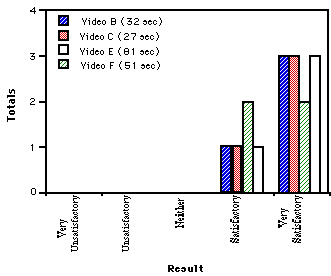
answers are summarised in Figure 9. The qualitative results show very positive attitudes to the cinematic
approach. All users were either satisfied or very satisfied even for video clips of up to 81 seconds. Attitudes
towards the textual interface were less positive.

(a) Textual Interface
(b) Cinematic Interface
Figure 9: Task 'satisfaction' for the Cinematic and Textual page designs.
It is important to remember that the retrieval delays were constant between the clips in both of the cases shown
above. In other words, there must be some other influence upon user satisfaction with these different page
layouts. We are currently analysing additional data that was gathered during our evaluation. This suggests that
task users show a more positive attitude to the download but only when the task completion is regarded as
successful. When the user does not perform the task in a satisfactory time, i.e. inside the time allowed by a
teacher, then the user's attitude is considerably more negative. In the case of the cinematic interface, users were
more likely to complete the task because they could more accurately predict which video contained the
information that they needed from the still image that was used to index the clip.
Principle 9: Never Underestimate the Element of Surprise
Given that retrieval delays are not the only factor that affects user attitudes towards web-based video archives, it
is important to ask if designers can exploit any other techniques to increase user satisfaction? One means of
achieving this is to introduce elements of surprise or game playing into an interface. These approaches are
especially appropriate in educational software where video clips can be used as a reward for good performance.
They can be used to retain user interest. They can also increase levels of acceptance for material that is
presented in other formats (Neal, 1990). Figure 10 shows how an element of surprise can be introduced into the
delivery of video material over the web. This interface to another section of the Hunterian Museum's web site
presents an image map of the route taken by Captain Cook in his third voyage of discovery (1776-1780). By
selecting certain different areas of the screen, users can access information about the areas that Cook visited
during this voyage. Some selections result in question and answer sessions, others provide access to textual and
photographic records, further areas provide access to video footage. The intention is to support 'learning by
exploration' within the overall topic framework provided by the map (Carroll, 1985).
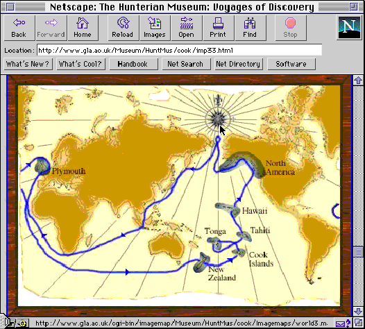
Figure 10: Image Map Showing Captain Cook's Second Voyage of Discovery
The interface in Figure 10 violates some of the principles that were advocated in previous sections. For example,
the cinematic layout of Figure 6 was successful because it explicitly represented the content and production
quality of each video. This information is deliberately hidden in Figure 10 because the user cannot even tell if
there is any video material linked to the page. This illustrates an important point about the application of
guidelines. Designers should not attempt to achieve all of the principles that are advocated in this chapter.
They must, however, have a clear reason for violating any guidelines that they do reject. It is difficult to under
emphasise this point given the mediocre nature of many of the video pages that are currently published on the
web.
Principle 10: Never Take A Designer's Word For It...
This principle is included as a warning against introspection. The previous section argued that designers must
only violate a principle if they have a clear reason for doing so. This section argues that designers must seek
empirical evidence to determine whether these reasons are justified within the context of a particular interface.
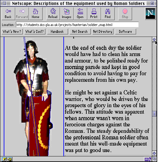
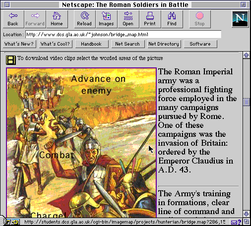
For example, Figure 11 presents two different techniques that can be used to prompt users about the location of
video material within an image map. These layouts do not achieve the element of surprise that was intended in
Figure 10. The intention is, however, to index video clips with information about the context of particular objects
or subjects. In other words, a video about the use of a shield can be retrieved by selecting a shield. A video
about the roman tactics during an advance can be indexed by selecting a picture of an advance. The interface on
the left indicates the presence of a video clip by outlining areas of the image in a 'special' colour. In this
interface, it was a bright purple. The spear and shield in Figure 11 are outlined in this manner. The layout on
the right uses an image map to associate video clips with textual labels. Combat, Advance on enemy and
Charge all index different clips. A third design was also produced in which coloured spots were placed next to
areas on the image map that could be selected to retrieve a video. These were similar to the pins that might be
placed into a postcard or map.
(a) Outlined Areas
(b) Textual labels
Figure 11: Image Map Interfaces to Video Pages
An evaluation was conducted to compare the users' reactions to the designers' expectations for these different
layouts. Thirty school-children from the West of Scotland were asked to select which of the interfaces shows
the selectable areas most clearly? Web-page designers from the staff and undergraduates of Glasgow University
were then asked to predict which of the two interfaces would best present the selectable areas for our target
population. Everyone in this second group had considerable experience of web design and had undergone at
least two years of training in Human-Computer Interaction. Figure 12 presents the results.
 (a) Designer's reaction
 (b) User's response
Figure 12: Differences Between the Designers and Users of Web-Based Video Systems
The findings came as a considerable surprise to the development team. Nobody had predicted the apparent
unanimity amongst the potential users of the system. Many of the designers had even considered abandoning the
labelled presentation technique in favour of the outlined approach. The important point, however, is not that
users preferred one layout over the others. Nor is it that designers cannot accurately predict user preferences. It
is, rather, that there is no substitute for direct user trials given the lack of any theoretical framework or applicable
empirical research that might otherwise guide the development of web-based video archives.
Conclusion
This paper has presented ten principles that support the provision of video material over the world-wide web:
- Principle 1: Avoid Video for Video's Sake
- Principle 2: Make Sure That Users Can Access the Video
- Principle 3: Maximise the Production Quality
- Principle 4: Edit The Clip to Minimise File Size
- Principle 5: Use Mirror Sites if Necessary
- Principle 6: Support Both Browsers and Directed Users
- Principle 7: Indicate The Quantity and Quality of Video Material
- Principle 8: Assess Overall Task Satisfaction
- Principle 9: Never Underestimate the Element of Surprise
- Principle 10: Never Take A Designer's Word For It...
It is important to stress that these are heuristic guidelines. They have been compiled during the development of
existing web sites. It, therefore, follows that other practitioners may identify omissions from our list. For
example, we have not provided any direct guidance on the direction of video footage. Further work intends to
address this limitation by further investigating the use of 'sharp cutting' techniques in conventional films
(Bernstein, 1988). This approach uses a number of cinematic techniques to maximise the impact and
information content of relatively short film clips.
Finally, it is important to return to our tenth principle: never take a designer's word for it.... This emphasises the
need to obtain direct empirical evidence for claims about the 'usability' of web pages. Unfortunately, many of
the methodologies that have been developed to examine 'conventional' interfaces cannot easily be applied to
evaluate distributed, information retrieval systems. The traditional measures of precision and recall completely
ignore the temporal problems that arise during interaction with the web (Teal and Rudnicky, 1992). Without
further work in this area, it is important that designers are provided with principles or guidelines that build upon
the successes and failures of previous interfaces. Without such guidelines, users will be continue to tie up their
machines for long periods while mediocre footage is retrieved across heavily loaded networks.
Acknowledgements
The web pages described in this paper were developed with Robert Anderson, Ian Dunn, Sean Hundtofte,
Thomas Mackenzie and John Montgomery of the Department of Computer Science, University of Glasgow and
Jim Kavanagh, University of Paisley. The video clips were produced by this team and by the Scottish Television
'Skoosh' crew with Lindsay Hill (the presenter) and Beverley Morrison (producer). Video Stills © Skoosh, Cool
Crew Productions for Scottish Television. Special thanks are due to Jim Devine and the staff of The Hunterian
Museum for their help and encouragement in this work.
References
- Bernstein, S. (1988), The Technique of Fim Production. Focal Books, London, United Kingdom.
- Carroll, J.M., Mack, R.L., Lewis, C.H., Grischkowsky, N.L., and Robertson, S.R., (1985), Exploring Exploring A
Word Processor, Journal of Human Computer Interaction, (1):283-307
- Dix , A.J (1987). 'The Myth of the Infinitely Fast Machine'. In D.Diaper & R.Winder (eds), People and
Computers III , Cambridge University Press, 215--228.
- Gray, P & England,D & McGowan,S (1994) 'XUAN:enhancing UAN to Capture Temporal Relationships among
Actions' . In Cockton.G, Draper.S.W & Weir G.R.S (eds) People and Computers IX, Proceedings of HCI'94,
Glasgow, 1994. 301--312.
- Johnson, C. (1993) A Formal Approach To The Presentation of CSCW Systems. In J.L. Alty, D. Diaper and S.
Guest, editors, People And Computers VIII, Cambridge University Press, Cambridge, United Kingdom, 335--352.
- Johnson, C (1995). 'Time and the Web : Representing and Reasoning About Temporal Properties of Interaction
with Distributed Systems.' In M. Kirby & D.Diaper (eds), Human Computer Interaction' 95, Cambridge
University Press, Cambridge, United Kingdom, 1996, 39-50.
- Johnson, C (1996). Electronic Gridlock, Information Saturation and the Unpredictability Of Information
Retrieval Over the World Wide Web. In F. Paterno and P. Palanque (eds.) The Application of Formal Methods,
Springer Verlag (forthcoming).
- Johnson, C & Kavanagh, J (1996). 'Electronic Gridlock : The Problem of Download Latency for Video on the
Web'. In A. Blanford and H. Thimbleby (editors), Adjunct Proceedings of HCI'96, London, 1996, 78-89.
- Kuhmann, W. (1989) The Stress Inducing Properties Of System Response Times, Ergonomics, (32)3:271--280.
- May, J. & Barnard, P. (1995). Cinematography And Interface Design. In K. Nordby, P. Helmersen, D. Gilmore
and S. Arnesen (editors), Interact '95, Chapman and Hall, London, 26-31.
- Neal, L. (1990) Implications of Computer Games for Systems Design, In D. Diaper, D. Gimore, G. Cockton and
B. Shackel (eds.) Interact'90, Elsevier Science Publishers, Noth Holland, 93-99.
- Pejtersen, A.M., (1989) A Library System For Information Retrieval Based On A Cognitive Task Analysis And
Supported By An Icon Based Interface. In ACM SIGIR Proceedings, Boston. ACM Press, New York, United
States of America.
- Teal, S.L & Rudnicky, A.I (1992).'A Performance Model of System Delay and User Strategy Selection'. In
P.Bauersfeld, J.Bennet & G.Lynch (eds) . Proceedings of CHI'92: Human Factors in Computing Systems, ACM
Press, New York, United States of America, 295--305.
(a) Designer's reaction
(b) User's response