[6 marks, bookwork/seen problem]
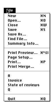
This menu supports the transition between novices and experts by
providing clues about the keyboard accelerators that are available (clover-
P to print, clover-N for a new file). These prompts may actually distract
people who are new to this style of interaction. For intermediate users,
they help to reinforce the available keyboard shortcuts.
This menu also exploits the transition between novices and experts through
chunking. Novices may not know where a particular menu option is
located. By grouping similar items together, the designer helps users to
locate all of the print options, all of the save options etc.
Other solutions might refer to the more recently/frequently used file items
above the Quit option.
(b) Briefly explain how the previous menu uses chunking to reduce the cognitive loading on both expert and novice users.
[8 marks, seen problem]
The answer to part (a) suggested that chunking helps the transition between novice and expert. This is because users need only remember the approximate location of individual menu items. This, in turn, reduces the burdens that the interface imposes upon the user's memory. In the case of the novice, this may be most apparent in the reduction on short-term memory. They are not forced to continually look up the location of individual items. In the case of an expert, chunking helps to reduce the number of individual items that must be consigned to long term memory when using the system. Many experts may not be able to tell you the exact ordering of individual items within a chunk but they will be able to identify the rough location of the chunk itself.
(c) The Johnson-Dunlop Corporation have been hired to design a menu-based interface to the room booking system for the University. One interview with the potential users revealed the following:
"Well none of us knows how to use a computer and we're all a bit scared of them... Oh yes, we've all been doing this for a few years now and well, basically, we just have busy periods when we book all of the rooms for the next year. We spend every minute of the day making bookings. Then it goes quiet for a few months..."
Briefly explain why your user group would be experts, novices or some
blend of the two.
[16 marks, unseen problem]
This quotation reveals a complex blend of expertise. On the one hand the
users are computer 'illiterate' and may, indeed, be scared of using these
devices. On the other hand, they have been in their jobs for some time
and will be experts in their task domain. A third issue here is that even
though they are experts in their task domain they may be infrequent users
of any system because it will only be used for a few weeks of year.
Finally, one might anticipate a high level of skill to be built up with the
system during that relatively intense burst of activity.
The key conclusions from this might be that the users are infrequent,
novices but that there should be scope for expert behaviour to speed their
interaction as they become more skilled during the intense periods of
interaction with the system. Keyboard accelerators, such as those shown
in part (a), are an example of such a technique although these imply a
base-level of computer literacy.
(d) Sketch a potential screen layout for the new system. You should show the items in at least two menus. These must enable the user to view all of the bookings for a particular lecture theatre. You should also be able to add and delete bookings. Briefly write a justification or rationale for the design that you have produced. In particular, you should link your design to the comments made in your answer to part (c).
[20 marks, unseen problem]
There are a vast range of potential answers to this question. In particular, I would be looking for some context in the display - to tell the users the name of the application and the room(s) that they were booking. There should also be some form of help facility, either in terms of a status bar, balloon help, help menu etc. The menus should use chunking and provide a limited number of keyboard accelerators. These accelerators should be associated with the most common tasks to provide maximum benefits for expert users. Additional marks for a first class design might include form- based indexing into menus or user-configurable menus or most frequent/recent rooms as in the previous file menu.
12 out of the 20 marks should go for the rationale. As in (a) the design should be justified in terms of the transition between novice and expert. The form based indexing would provide a good example where long menus (e.g., room selection) can be avoided by directly typing into a field in a tool bar.